
Stop designing chatbots
On defaulting to chat as the interface for AI products — and why it's holding you back.
In my work at Fractional AI, I get a front-row seat to how companies are actually applying AI — across industries, use cases, and maturity levels. And there's a design mistake I keep seeing that's holding a lot of teams back.
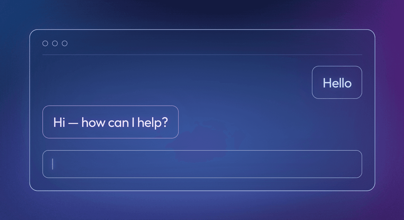
Here's how it goes: someone decides to add AI to their product, so they sketch out a little chat window. Users type questions, the AI responds. Ship it.
It’s so easy! And for a lot of use cases, it's completely wrong.
The chatbot trap
Chatbots are genuinely great for some things – customer support, research assistants, general-purpose Q&A – tasks where the back-and-forth is the point. But the moment you're building something with a specific job to do (a workflow, a task, an action) the chatbot mold starts to crack. Design for AI is a new discipline, and when there's no clear standard, it's easy to default to what you know (ahem, ChatGPT). But force it into a chat interface it doesn't belong in, and the capability gets buried under bad UX. You don't handicap a great tool by forcing it into the wrong shape. The right shape comes from designing for the user first, the technology second.
Three places where "just use a chatbot" is the wrong answer
1. Complex search queries
Natural language search is genuinely magical. Instead of remembering the exact syntax for a filter, users can just describe what they want: "Show me all open deals in the northeast over $50k that haven't been touched in 30 days." That's a great use of AI.
But for a risk management platform we worked with, using a chatbot to represent their “applications” would have meant showing users a wall of unreadable text in place of something that's fundamentally a rich, structured information architecture: interdependent workflows, hundreds of nested steps, complex dependencies.

>> This representation flattens the application’s complexity…and confuses the information architecture. Does this chatbot store applications? Sessions? What am I looking at? |
The better solution leveraged the existing UI: a DAG-like interface that already represented applications in full fidelity, with all their dependencies, workflows, and complexity laid out visually. Users specify the changes they want in natural language, and the application updates in the interface they already know. The endless clicking and form-filling is gone, but the output stays structured, navigable, and immediately recognizable to the people who work in it every day.

>> Much better! |
The principle: Use natural language to capture intent, then design an interface for the output that matches the sophistication of the task.
2. Task automation in existing UIs
The best design choice is often the one that's invisible – one that makes AI feel like magic.
To connect data sources in Airbyte, an open-source data integration engine, users need to build API connectors, and building them is painful. You dig through inconsistent documentation to configure authentication, pagination, endpoints, and more. It pulls engineers away from higher-value work.
Fractional AI built Airbyte an AI-powered Connector Builder that collapses that process dramatically. The user pastes in an API documentation URL. The AI crawls it, figures out everything it needs, and pre-populates all the fields directly into Airbyte's existing Connector Builder UI. The user reviews and finalizes. Hours of work becomes minutes, and after launch, Airbyte saw a marked increase in connectors being built.
No back-and-forth. The user just shows up to a form that's already mostly filled out.
https://youtu.be/_xtW0QS890Y?si=LIp1TLD175vSx0zZ
The principle: Good AI design is invisible — don't build a new interface for it. Make the existing one smarter.
3. Deep Research
We applied this for a healthcare client where clinicians spent most of their day on lookup work: manually reviewing patient diagnosis opportunities, cross-referencing codes in an external database, doing their own research, deciding whether to act — none of it patient care. A chat interface in front of that workflow only solves part of the problem. With the right design choices, an agent can do the thinking and the clicking for you.

A much better user experience is one where the agent handles everything upstream: reviewing opportunities, pulling relevant codes, cross-referencing external sources, and surfacing a short list of recommended PDX updates, each with a confidence score and a rationale. When the clinician sees the interface, the knowledge they need is already there.

The principle: A chatbot makes a hard task conversational. Good design can make it disappear.
Don't let the chat box be your ceiling
In each of these cases, the goal isn't AI that's easiest to chat to. It's AI that does things for you and gets out of the way. As product designers, our job is to design the best interface for the task, not the technology (however shiny).
Our path forward is the same one it's always been: center the user. Design is meant to simplify, to ease, to make labor feel less like labor. AI gives us more power to do that than we've ever had. Let's not waste it on chat windows.